The Pitfalls of Chinese Pixel Fonts
I have been building Xprite, a web-based pixel-art and animation editor modeled on Aseprite. It opens Aseprite's .aseprite projects directly, and its UI copies Aseprite's pixel look down to the buttons and menus.
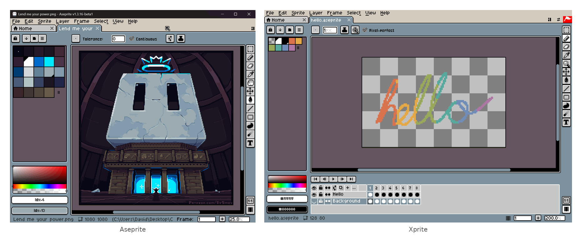
The English UI took almost no effort. Aseprite's interface font is licensed under CC BY 4.0, so I converted it to WOFF2 and dropped it in, and everything looked right.
Aseprite's UI font
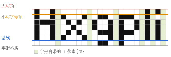
Aseprite ships only two UI fonts: the default is 7px tall, Mini is 5px. Laid on a grid, you can see how much the author had to compromise at that size.
-
Capitals fill 6 rows and lowercase only 1 fewer; g, p, y drop just 1 row below the baseline, so 7px text still reads dense.
-
Strokes are all 1px, with no bold or italic.
-
Glyph widths vary: i and l are 2px, m and W are 8px. The spacing lives in the blank column drawn on each glyph's right edge.
-
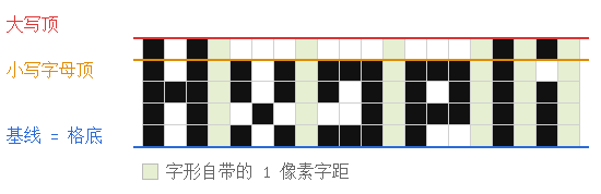
Mini is even tighter. It drops descenders entirely, so g and p squeeze into 5 rows with the baseline on the cell floor.
Scaling is integer-only too. Aseprite's Screen Scaling and UI Scaling only offer 100%–400%, so fonts, strokes, and scaling all sit on the same grid.
Those two fonts only cover Latin and Cyrillic. When Aseprite's own Chinese UI hits a Han character, the fallback chain hands it to a system font — Microsoft YaHei on Windows, Noto Sans CJK on Linux — so the Han characters are never pixel-rendered.
I assumed the Chinese version would be easy. GitHub is full of Chinese pixel fonts; pick one, drop it in.
It ended up taking longer than the whole English UI.
There are fewer real choices than you would think
The fonts you can find
Chinese pixel fonts are hard to make. Latin letters plus punctuation need a hundred or so glyphs that one person can draw in days, but GB2312 alone has 3,755 first-level Han characters, and UI copy, filenames, and layer names pull in even rarer ones. 8px is roughly the smallest a Han character stays legible; squeezing 藏 or 疆 into an 8×8 cell means deleting strokes and merging components. More glyphs also means more bytes — Aseprite's whole English font is under 6 KB, while a Chinese pixel font easily runs to hundreds of KB.
Still, a search turns up plenty of names:
| Font | Size | Coverage | License |
|---|---|---|---|
| 缝合像素字体 Fusion Pixel | 8/10/12px | 10px covers GB2312 level 1 | ✅ OFL 1.1 |
| 方舟像素字体 Ark Pixel | 10/12px | 10px level 1, only 602 chars | ✅ OFL 1.1 |
| Z工坊像素黑体 Z Labs Pixel | 12px | General Standard characters | ⚠️ OFL, reserved name |
| 美績點陣體 MisekiBitmap | 8px | 13,248 Han characters | ✅ OFL 1.1 |
| 目哉像素 MuzaiPixel | 8×12px | GB2312, General Standard | ✅ OFL 1.1 |
| 寒蝉点阵体 ChillBitmap | 7/16px | 7px, 13,600 chars total | ✅ OFL 1.1 |
| 凤凰点阵体 Vonwaon Bitmap | 12/16px | 6,763 Han characters | ⚠️ CC0, unclear origin |
| 秋叶圆体 16 | 16px | GB2312, common Big5 | ✅ OFL 1.1 |
| 最像素 Zpix | 12px | 22,237 chars | ⚠️ Paid for commercial |
| 文泉驿点阵宋体 WenQuanYi | 12–16px | All basic Han characters | ⚠️ GPL w/ embedding exc. |
| GNU Unifont | 16px | All basic Han characters | ✅ OFL / GPL |
| 精品點陣體 9×9 | 10px | 12,858 chars, both scripts | ✅ OFL, reserved name |
| 俐方體 11 號 Cubic 11 | 12px | Common CJK, GB2312 level 1 | ✅ OFL, reserved name |
| 美咲フォント Misaki | 8×8px | JIS levels 1 & 2 | ⚠️ Author's license |
| Silver | — | Latin, CJK, more | ⚠️ CC BY, big projects |
Most trace back to the same few sources
A dozen fonts looks like plenty. But reading each README and tracing the credited sources, most of them descend from the same few ancestors.
-
Almost every 8px font descends from 美咲フォント (Misaki): 精品點陣體 7×7, 美績點陣體, and 寒蝉点阵体 7px are all modifications of it.
-
At 16px you cannot avoid Unifont. Unifont's Han glyphs come from 房骞骞's Unibit 1.1, which in turn came from the bitmap glyphs of the GB 19966-2005 national standard, and 寒蝉点阵体 16px derives from Unifont.
-
缝合像素字体 (Fusion Pixel) is literally a stitch-up: it takes 方舟像素字体 (Ark Pixel) as a base and fills the characters Ark has not drawn yet with Misaki, 美績, 精品, 俐方體, and Galmuri. The author calls it a "temporary transitional solution" for Ark.
The merged edges in the diagram are labeled with sizes, which is easy to misread. The number in a name like 精品 9×9 refers to how big the Han glyph itself is drawn, whereas Fusion's 10px is the whole em-square, with the extra 1px reserved as side bearing. I rendered Fusion's simplified monospaced build glyph by glyph to spot-check, and nearly every Han glyph's ink is exactly 1px smaller than its em-square:
| Source font | Han size | Size in Fusion |
|---|---|---|
| 精品點陣體 7×7 | 7 × 7 | 8px |
| 精品點陣體 9×9 | 9 × 9 | 10px |
| 俐方體 11 號 | 11 × 11 | 12px |
Licensing
That filters out another batch:
-
Z工坊, 精品點陣體, and 俐方體 all reserve their font name in the OFL, so a subsetted repackage has to be renamed.
-
最像素 (Zpix) is free only for personal and educational use; commercial use costs money.
-
Silver is free for commercial use, but projects with a budget over $100k need a separate agreement.
-
凤凰点阵体 is released as CC0, but its bitmaps come from aguegu's BitmapFont, originally taken from DOS-era HZK bitmaps, so the copyright is unclear.
-
美咲フォント uses a license the author wrote themselves; Fusion labels it "untyped license, OFL 1.1 compatible," and every downstream font's license traces back to that.
Coverage
For the survivors, I tested coverage with the same UI string.
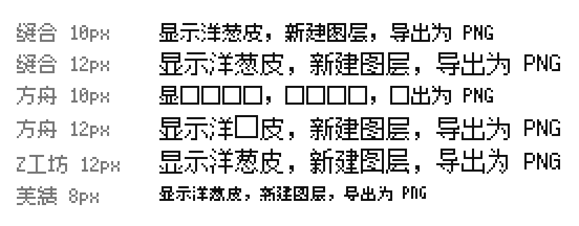
Ark 10px drops more than half the glyphs, and 12px still misses 葱. After coverage and a license that allows redistribution with a web app, only a few remain, clustered at 8, 10, 12, and 16px — and size turned out to be the hardest constraint.
Font size must be an integer multiple
Integer multiples of physical pixels
A normal web font is a vector outline: the browser rasterizes it at any size and smooths the edges with antialiasing, so 13px and 15px both look fine. A pixel font is built from squares, and only an integer scale puts every square on the pixel grid. At 1.5×, square edges land between physical pixels and the strokes blur.
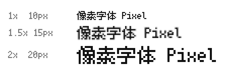
That integer is measured in physical pixels, so devicePixelRatio goes into the formula:
font-size × devicePixelRatio ÷ design size = integer
The CSS font size does not have to be a multiple of the design size, as long as it becomes an integer after the screen multiplier. On a 2× display, a 10px font set at 15px is sharp: 15 × 2 ÷ 10 = 3, so each square is exactly 3×3 physical pixels. Set it to 14px and it blurs, because 14 × 2 ÷ 10 = 2.8.
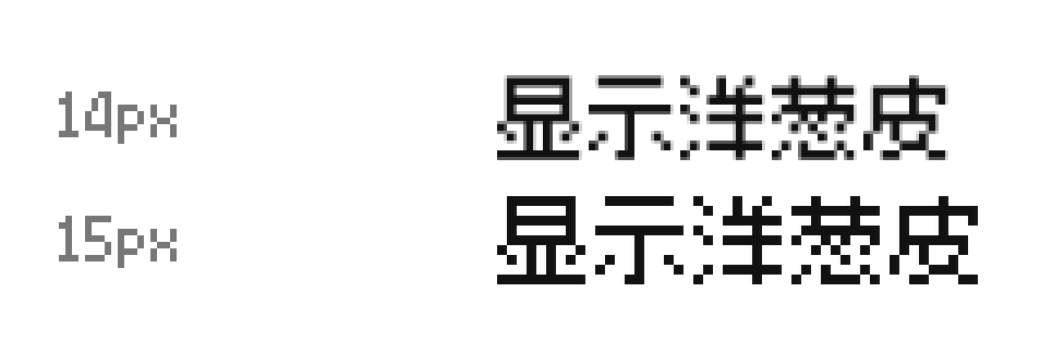
Three ways to render Chinese
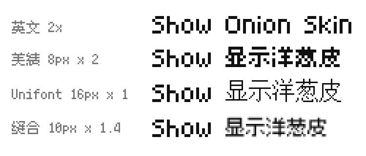
The catch is that the English UI was already set: Aseprite's 7px font drawn at 2× makes a 14px line with 2px strokes. To sit Chinese on the same line, there are three options.
-
Scale an 8px font 2×. The pixels stay crisp and the strokes are 2px, matching English. But an 8×8 cell already packs strokes together, so scaling just enlarges a blob — 洋葱 is barely legible at UI size.
-
Show a 16px font at native size. Unifont is a genuine 16×16 design with intact structure and no scaling. But its strokes are 1px, so next to the 2px English strokes Chinese looks a shade lighter, and 16px is taller than the 14px line.
-
Scale a 10px font 1.4×. Fusion 10px drawn at 14px matches the English height, reads far better than 8px, and its strokes come close to 2px. The cost: 1.4 is not an integer, so stroke widths vary and the edges carry gray.
There is no integer relationship between 14 and 10. To get both right, either find a legible 7px Chinese font (none exists) or change the Chinese line to 20px so a 10px font scales a clean 2× — at the cost of reflowing every control.
What I chose
Option 1 is unreadable, option 2 mismatches English weight, so I went with option 3: the simplified build of Fusion 10px. It covers all of GB2312 level 1 and about 70% of level 2, the OFL allows redistribution in a web app, and since it is built on Ark, switching once Ark finishes 10px is easy.
The 1.4× error cannot be removed, only hidden. When drawing Han characters to canvas I binarize the semi-transparent pixels with a threshold slightly below half, so thin strokes do not vanish entirely. The text tool inside the artwork makes no such compromise — Han characters only scale by integer multiples of 10px.
You cannot conjure a bold weight either
The size problem repeats itself with weight.
Faux bold
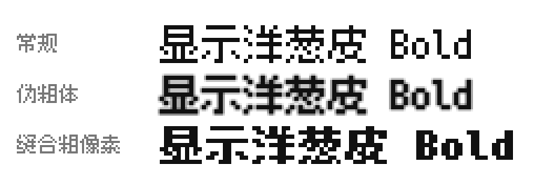
Set font-weight: bold in CSS without a bold file and the browser synthesizes a "faux bold" by inflating the outline proportionally. The extra width rarely lands on a whole font pixel, so horizontal and vertical strokes end up uneven and the edges blur — the same disease as non-integer scaling.
Ready-made bolds
A pixel bold has to be drawn as a separate set, or computed by pixel rules. Ready-made options are scarce:
-
Fusion has an algorithmic bold build, 「缝合粗像素字体」 — the third row above — which widens every stroke by a clean 1px, though the author calls it a test project.
-
Ark, Z工坊, and Miseki only ship a regular weight, and Aseprite's fonts have no bold either.
-
精品點陣體 9×9, Galmuri, and WenQuanYi Bitmap Song do have bolds, but their sizes do not fit a 14px line.
In the end I shipped no bold. The UI sets font-synthesis: none globally so the browser will not synthesize bold or italic, and the text tool simply disables its "B" button when a bitmap font is selected.
Line height and baseline
Baseline
Putting Chinese and English on the same line first hits the baseline. When Aseprite's font is drawn at 2× as 14px, capitals run from the line top down to pixel 12, leaving 2px at the bottom for descenders like g and p. After Fusion 10px is scaled 1.4×, a Han glyph is 13px tall — 1px taller than the capitals. Share one baseline and the Han glyph's bottom edge lines up with English, but its top edge pokes 1px out of the line box.
Centering each glyph
My first approach measured each Han glyph's actual ink and centered the ink in the line box:
const metrics = ctx.measureText(char);
const baselineY = Math.round(
  (size + metrics.actualBoundingBoxAscent - metrics.actualBoundingBoxDescent) / 2,
);
The Han glyphs did fit inside the line box, but they sat visibly low. The line box's center is 1px below the capitals' center, because the bottom 2px of the box is reserved for descenders most English never uses. Per-glyph centering has another flaw: a character like 一 or 口 whose ink does not fill the cell gets nudged away from the position the font author gave it.
Shift the whole font down 1px
Chinese and English only differ by a fixed 1px, so there is no need to measure per glyph. I shifted the entire Chinese font's glyphs down 1px, aligning the Han top edge with the capitals' top edge and letting the bottom edge dip 1px into the descender zone. Ordinary Chinese fonts are designed the same way — in Source Han Sans, the bottom of the Han em-square sits 0.12em below the Latin baseline.
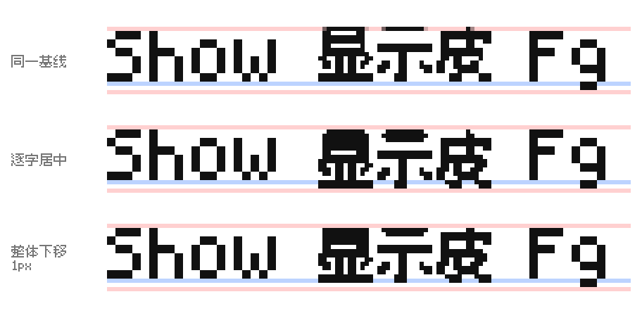
While shifting the glyphs, I also rewrote the font's declared ascent and descent to match Aseprite's 10/14em and 4/14em. That change is for line height, covered below.
Editing the font with fontTools
Both edits are done directly on the font file in Python with fontTools:
-
Fusion is 1000 units per em, and at 14px 1px ≈ 71 units, so every glyph outline is translated down by 71.
-
Ascent and descent live in three places: one in the
hheatable, and two groups (typoandwin) inOS/2. All three must be changed, or different systems read different values.
from fontTools.ttLib import TTFont
from fontTools.pens.t2CharStringPen import T2CharStringPen
from fontTools.pens.transformPen import TransformPen

font = TTFont("fusion-10.woff2")
glyphs = font.getGlyphSet()
charstrings = font["CFF "].cff.topDictIndex[0].CharStrings
for name in font.getGlyphOrder():
    pen = T2CharStringPen(font["hmtx"][name][0], glyphs)
    glyphs[name].draw(TransformPen(pen, (1, 0, 0, 1, 0, -71)))  # shift down 71 units
    old = charstrings[name]
    charstrings[name] = pen.getCharString(private=old.private, globalSubrs=old.globalSubrs)

hhea, os2 = font["hhea"], font["OS/2"]
hhea.ascent, hhea.descent, hhea.lineGap = 714, -285, 0
os2.sTypoAscender, os2.sTypoDescender, os2.sTypoLineGap = 714, -285, 0
os2.usWinAscent, os2.usWinDescent = 714, 285
font.save("fusion-10-aseprite.woff2")
CSS @font-face also has ascent-override and descent-override, which cover the last two of the three, but shipping Safari does not support them, and shifting glyphs can only be done in the font file anyway. Under OFL a modified font needs a new name — Xprite calls it FusionPixel10Aseprite — and it is only used for 14px UI text. The 10px spots keep the original, because the same 71 units is only 0.71px at 10px and the strokes would straddle two rows.
Line height
A pixel UI's line height must be an integer number of pixels, ideally a multiple of the scale factor; half a pixel off and the next line shifts or blurs. line-height: normal is not a fixed value: the browser takes the tallest ascent plus the deepest descent of every font used on the line. Fusion's declared ascent was 0.9em, so a pure-English line is 14px, but the moment a Han character appears, Chrome makes that line 17px and the whole column of text jumps up and down.
Pin the line height to 14px and the lines align, but the Han glyph still overflows the line box into the line above. After the metric edits, both fonts report the same height to the browser, so line-height: normal keeps a Han-containing line at 14px and the glyph inside its box.

The UI still writes every line height as an integer: text lines equal the 14px font size, menu items are 22px with text top at pixel 4, and list items are 18px.
The text tool has no line spacing at all. Like Aseprite it only draws a single line, takes the tallest glyph for the box height, gets pushed taller by Han in mixed text, and aligns both fonts by the lower baseline.
Antialiasing and fractional coordinates
Where the gray fringe comes from
When the browser draws text, it computes how much of each physical pixel a glyph covers and paints partial coverage as half-gray — that is antialiasing. If a pixel font's squares align to the pixel grid, every pixel is either fully covered or untouched, so the output is only black and white.
Misalign the squares and the fringe appears. Beyond the non-integer scaling covered earlier, it also happens when text starts on a half pixel. A 200px dialog centered in an 801px window gets a margin: auto left margin of 300.5px; every 1px vertical stroke inside then straddles two physical pixels at half coverage each, so one black line becomes two gray lines.
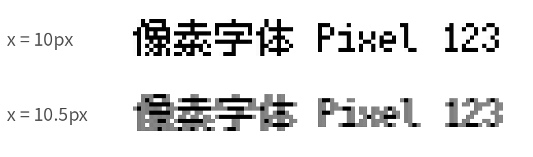
Many other constructs smuggle in fractional coordinates; Fixing blurry pixel fonts has more examples:
-
Padding written in percentages or rem
-
Transforms that translate
-
Fractional glyph widths in a fallback font
-
fillTexton canvas: sharp at integer coordinates, gray at x + 0.5
Snapping coordinates
So every layer holding text needs integer positions and sizes. CSS cannot guarantee that, so you round during layout. Centering is not left to margin: auto; the left margin is computed and floored:
const left = Math.floor((parentWidth - width) / 2);Xprite lays its whole UI on its own grid: window width and height are divided by 2 and floored to get the UI's pixel count, every panel's position and size is computed as an integer on that grid, and the result is drawn at 2×.
Integer CSS pixels still land mid–physical-pixel at 125% or 150% system scaling. To snap to physical pixels you convert, round, and convert back:
const dpr = window.devicePixelRatio;
const snap = (x: number) => Math.round(x * dpr) / dpr;
For canvas size you can read the physical-pixel dimensions directly from a ResizeObserver's device-pixel-content-box; web.dev has a detailed writeup. But the font size itself still has to satisfy the integer-multiple formula from earlier, or the cleanest coordinates will not help.
Disabling antialiasing only works on macOS
Many articles tell you to turn off antialiasing with CSS:
-webkit-font-smoothing: none;
-moz-osx-font-smoothing: grayscale;
font-smooth: never;
None of these are in the standard. MDN says the first two only apply on macOS, -moz-osx-font-smoothing has no none value, and in Chromium's source only the macOS font code reads -webkit-font-smoothing. I added all three lines to Chrome on Linux and not a single pixel changed.
Embedded bitmaps get stripped
Bitmaps embedded inside a font file cannot be used on the web either. OpenType can store bitmaps in the EBDT and EBLC tables, but Chrome passes web fonts through OTS at load time and both tables are removed. Every pixel font on the web is actually an OTF, TTF, or WOFF2 that draws pixel squares as outlines.
In the end
The whole solution is a few lines: English uses Aseprite's 7px font at 2×; Chinese uses Fusion 10px at 1.4× on the same line; every glyph is shifted down 1px with the font metrics rewritten; line heights are pinned to integers; and there is no bold. That nearly-400KB Chinese font is only preloaded when the UI language is CJK or the skin uses a bitmap font — the launch screen ships a sub-1KB English subset.
Plenty is still unsolved:
-
The Han glyphs in the UI are not integer-scaled, so they only look pixel-rendered — stroke widths vary and the edges carry gray.
-
Alignment is hand-tuned. A checkbox shifted up 2px, a label given 1px more — all adjusted against screenshots, and switching fonts means starting over.
-
The first visit to the Chinese UI downloads ~400KB, and user input like layer names makes subsetting hard.
-
No bold, so the only way to emphasize a line of Chinese is to recolor it.
-
Under 125% or 150% system scaling even English cannot avoid resampling, and Chinese is worse.
The English side went smoothly only because Aseprite had already put size, stroke, and scaling on the same grid. Chinese has no ready-made grid, so I had to line it up one cell at a time.